
The weekend brand kit: what to create before Monday
Build a usable weekend brand kit with the few assets that make your offer clear, consistent, and ready to publish.
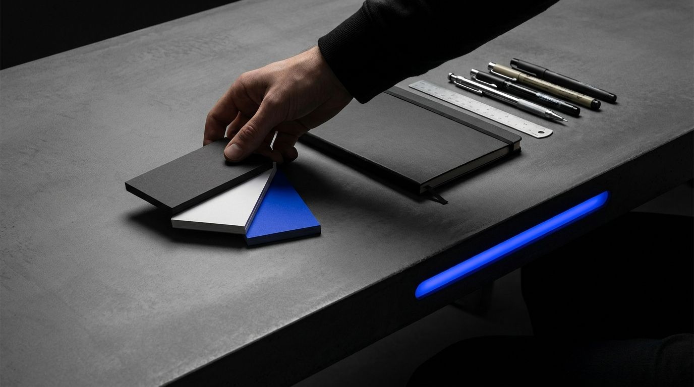
At 8:17 on a Saturday morning, your coffee is cold, your domain is live, and the landing page still looks like a Google Doc with a logo pasted on top. A weekend brand kit fixes that. You don't need a full identity system before Monday. You need a small set of decisions you can reuse across your site, social profiles, emails, and sales pages without reinventing them every time you sit down to publish.
The best quick brand identity has six parts: a clear promise, a simple wordmark, a small color set, one type pairing, a few reusable layouts, and rules for how the brand speaks. That's the practical version of solo founder branding. Enough consistency to publish. Not so much overhead that you spend your whole weekend choosing between 47 nearly identical shades of blue.

Start with the promise, not the logo
The first item in your weekend brand kit is not visual. It is one sentence that tells people what you help them do, who it is for, and what changes after they use it. If this sentence is vague, better typography will only make the vagueness look expensive.
Write a working promise using this structure:
- For a specific type of buyer
- Who has a specific problem or desired result
- This offer provides a specific change
- Without a cost or frustration they already dislike
Take Priya, a solo founder in Bristol building a digital meal planner for shift workers. "Healthy meal planning made simple" says almost nothing. "Five-minute meal plans for hospital staff working rotating shifts" gives the brand a buyer, a situation, and a reason to exist.
Now test the sentence with three questions:
- Can a stranger repeat it after one read?
- Does it describe an outcome rather than a feature?
- Would the intended buyer recognize their week in it?
Here's the part most people miss. The default advice is to start with the visuals, but that is backwards when you have one weekend. A visual system cannot rescue an offer that sounds like every competitor. Your promise should decide the mood, the examples, and the words that appear on your first landing page.
Write five rough versions. Say them aloud. Delete the one that sounds most like a pitch deck. Keep the one you could explain to a friend while standing in a supermarket queue.
This promise becomes your Brand Voice anchor. Use it in your homepage hero, profile bio, launch post, and first email. You can revise it after real conversations. You are not carving it into stone.
Choose a visual system you can repeat
A quick brand identity is useful only when you can reproduce it without opening a 40-page style guide. Pick a visual system that works in a website header, a square social graphic, a mobile email, and a small profile image.
Create these pieces:
- One wordmark using your brand name in a readable typeface
- One small symbol or lettermark for avatars and browser tabs
- One primary color, one support color, and two neutral colors
- One heading typeface and one body typeface
- One shape rule, such as rounded cards or sharp rectangular blocks
For the example brand "Shift Table," Priya might use dark navy for trust, warm yellow for action, an off-white background, and charcoal text. Her wordmark can use a bold sans serif. Her body copy can use the same family in a lighter weight. That is enough to make a landing page, an Instagram post, and a PDF feel like they belong to the same thing.
Do not pick colors from memory. Check contrast. The Web Content Accessibility Guidelines, WCAG 2.2, require a contrast ratio of at least 4.5:1 for normal body text and 3:1 for large text. A pale yellow button with white text may look cheerful in your design tool and become unreadable on a phone screen.
Use real content while you make these choices. A brand kit that only looks good with placeholder text is not finished. Put your longest likely headline into the layout. Add a five-line paragraph. Test a button label that contains more than one word.
And keep the file names boring: `logo-primary.svg`, `logo-mark.svg`, `colors.txt`, `type-rules.md`, and `social-template-01`. Your future self will thank you, probably without writing a formal note about it.
Build the six assets that make the brand usable
The brand launch essentials are the files that help you publish and sell, not every possible asset someone can request after reading a branding checklist. You can add those later, once the work earns the time.
Create this small asset pack:
- A primary logo in SVG and PNG formats
- A square mark for social profiles and browser icons
- A one-page brand sheet with colors, fonts, and spacing rules
- A homepage hero layout with the promise and one call to action
- Three social templates for an insight, a customer problem, and an offer
- An email signature or footer block with the brand name and link
The three social templates should not be three decorative frames. They should support three jobs. The insight template helps you teach one useful idea. The problem template helps a buyer recognize their situation. The offer template gives them a direct next step.
Consider Marcus, launching a paid library of spreadsheet templates for independent consultants from a small apartment in Leeds. His first brand kit does not need a custom illustration set. It needs a readable template screenshot, a consistent headline treatment, a short proof line, and a button that leads to the checkout page. That's it.
Make each asset work at small sizes. Open the social template on your phone. Shrink the logo until it resembles an avatar. Export the PDF and check it for broken links. Paste the email footer into Gmail or Outlook and send yourself a test message.
This is where many founders overbuild. They create a logo suite before they create a usable sales page. They order branded merchandise before they know which promise gets clicks. The real constraint is not taste, it is a limited number of hours and a brand that still needs evidence.
Put every approved file in one folder. Keep drafts separate. If a file is not ready to publish, label it as a draft rather than making yourself remember its status.
Write rules that stop brand drift
A solo founder branding system needs writing rules because you will make dozens of small decisions while tired. Without rules, your homepage sounds calm, your social posts sound excited, and your checkout page sounds like it was written by a committee that never met.
Write a one-page voice guide with four parts:
- The buyer's current situation
- The promise you repeat
- Words you use often
- Words and claims you avoid
For a brand serving independent consultants, the voice might be direct, practical, and slightly dry. It might use "project margin" and "scope creep" because buyers use those terms. It might avoid "unlock," "revolutionary," and "effortless" because those words make a modest tool sound dishonest.
Add three sentence examples. Show how the brand introduces a problem, explains a feature, and asks for a sale. Examples beat adjectives. "You can see which projects are profitable before you quote" gives you more to work with than "confident and empowering." Every time.
Then set a claim rule. If you cannot prove "saves ten hours a week," do not write it. Say "helps you review your weekly workload in one place." Clear claims age better, and they give you room to collect proof later.
A 2024 report from the Content Marketing Institute found that many B2B teams still struggle with consistent content production and clear messaging. A one-page guide will not solve distribution, but it can remove the recurring decision of what the brand is allowed to sound like.
Use your rules in a simple review pass:
- Is the promise visible?
- Does the copy use the buyer's language?
- Is the next action obvious?
- Did you make a claim you cannot support?
Once you frame it this way, brand consistency is less about artistic discipline and more about removing avoidable choices.
Match the kit to the places buyers will see it
A weekend brand kit should follow the buyer's path, not your folder structure. List the places where someone will meet the brand during launch, then make sure the same promise and visual rules survive each step.
For a small digital product, that path may include:
- A search result or social profile
- A homepage or landing page
- An email or direct message
- A checkout page
- A confirmation email or onboarding screen
Open each surface in a separate browser tab. Put them side by side. Look for practical breaks: the profile says "templates," the homepage says "coaching," and the checkout page uses a third name. Buyers do not experience these as separate departments. They experience one confusing brand.
Nadia, based in Manchester, is launching a research briefing for independent retail owners. Her profile bio says, "Weekly retail intelligence." Her landing page says, "A private market research community." Her payment page says, "Nadia's newsletter." None of those statements is false, but together they create unnecessary work for the buyer. If you've ever clicked away from a checkout page because you weren't sure you were still in the right place, you already know the feeling.
She could use one public line everywhere: "A weekly retail briefing for independent shop owners." Then explain the format on the page: one email, three market shifts, practical decisions to consider.
Resize the logo for each surface. Check the page on a narrow phone screen. Confirm that the call to action uses the same verb across the site and email. If the button says "Get the briefing" on the homepage and "Join now" at checkout, pick the clearer phrase and use it consistently.
The mistake most founders keep making is treating a brand kit as a collection of files. It is really a set of decisions that must hold while the buyer moves from attention to action.
Zentoko can help you keep those decisions current across per-brand voice, review-first drafting, multi-agent QA, and scheduling, but the first version still needs your judgment. Tools can catch a mismatch. They cannot decide what you mean.
Use the weekend as a production sprint
Do not spend Saturday in a font marketplace and Sunday wondering what happened. Give each block of time a job, a stopping point, and an output you can inspect.
A workable schedule looks like this:
- Saturday morning: write the promise, buyer situation, offer description, and claim rules
- Saturday afternoon: choose fonts, colors, logo treatment, and the shape rule
- Saturday evening: build the brand sheet and three social templates
- Sunday morning: apply the kit to the homepage, profile, and email
- Sunday afternoon: run the QA pass, export files, and publish a small test
Set a limit on every decision. Give yourself 30 minutes for type choices and 45 minutes for colors. If you are still comparing options after the limit, pick the one that passes readability and feels easy to reuse. Move on.
Your QA pass should include actual launch conditions. Use a phone with brightness reduced. View the logo as a small avatar. Read the homepage aloud. Click every button. Send the email. Ask one person who is not inside the project to answer two questions: "What does this offer do?" and "Who is it for?"
If they cannot answer, do not respond with a longer explanation. Fix the page.
Publish one small piece before the weekend ends. Marcus might publish a screenshot of the spreadsheet template with one practical margin calculation. Priya might post a five-minute meal plan for a night shift. Nadia might share one retail shift from the week and invite readers to join the briefing.
Watch the right signals. Track profile visits, landing-page click-through rate, email sign-ups, and paid conversions. Do not treat likes as proof the brand works. A post can attract attention while sending nobody toward the offer.
What I'm telling you is that the conventional advice to perfect the identity before you launch sounds sensible until you realize the identity is supposed to help real people understand a real offer. Ship the smallest coherent version, then let buyer language improve the next one.
Decide what can wait until week two
A first-version brand kit is not a promise to keep every choice forever. It is a boundary around what you need right now. Protect that boundary, or the weekend will disappear into low-value polish.
Move these items to a later backlog:
- A full illustration library
- Custom photography for every page
- Motion graphics and animated logos
- A 40-page brand standards document
- Merchandise and printed packaging
- Separate visual identities for every content category
You can revisit those items after you have evidence. A few paid customers, repeated questions, a clear content pattern, or a channel that consistently brings qualified visits gives you a real reason to invest.
You may also discover that your first visual choice was wrong. That is normal. If the audience responds to a serious promise, a playful palette may create friction. If people keep asking about a feature you never mention, your message may need more attention than your logo.
Keep a decision log with three columns: what you chose, why you chose it, and what would make you change it. This prevents you from reopening the same debate every Tuesday. It also helps when you're running several niche brands and your brain starts storing hex codes like they're family birthdays.
At the end of the weekend, ask whether the kit lets you do four things without starting from scratch:
- Publish a useful post
- Explain the offer in one sentence
- Make the homepage feel connected to the profile
- Give a buyer one clear next step
If yes, you have enough to launch. If no, repair the missing part before adding new decoration.
So the deeper lesson is simple: your first brand identity is not a monument. It is a production setup. Build the smallest one that lets you publish clearly, learn from buyers, and make the next decision with better evidence.
FAQ
What should be included in a weekend brand kit?
Include a clear promise, wordmark, small logo mark, color set, type choices, voice rules, homepage layout, social templates, and basic email signature. Export the files in formats you can use immediately, especially SVG, PNG, and a one-page reference document.
How do I create a quick brand identity without a designer?
Start with readable type, strong contrast, two or three colors, and one repeatable layout rule. Use real copy while you design, test the result on a phone, and ask someone outside the project what the offer does after one read.
How much should solo founder branding cost?
It can cost very little if you use accessible design tools and create a limited system yourself. Spend money when a specific problem remains, such as a logo that fails at small sizes or a page that does not explain the offer clearly.
Should I create a full brand strategy before launching?
No. Create the decisions that affect the first buying experience, then learn from actual visitors and customers. A full strategy is more useful after you know which promise, audience, and channel produce real interest.
What should I do after finishing my weekend brand kit?
Apply it to one landing page, one profile, one email, and one useful launch post. Test every link, publish the post, and track visits, click-throughs, sign-ups, and sales instead of judging the kit by visual polish alone.
Open a blank document now and write the promise your buyer should remember on Monday. Build every visual choice around that sentence, publish one real test, and let the market tell you what deserves version two.
Join the conversation
Subscribe to comment
Join the Zentoko newsletter to leave a comment. You'll also get our notes on running niche brands in your inbox. Unsubscribe anytime.